Creating a unified visual identity for the Competence Development Multicenter and its branches in Tyumen, Ishim, Tobolsk

Service
Branding project
Client
ANO "My Territory"
Date
Nov 2023 – May 2024
Developing brand concept and verbal identity
Defined brand positioning, values, and tone of voice
Structured naming system for the main center and branches
Ensured consistency in messaging across all communication channels
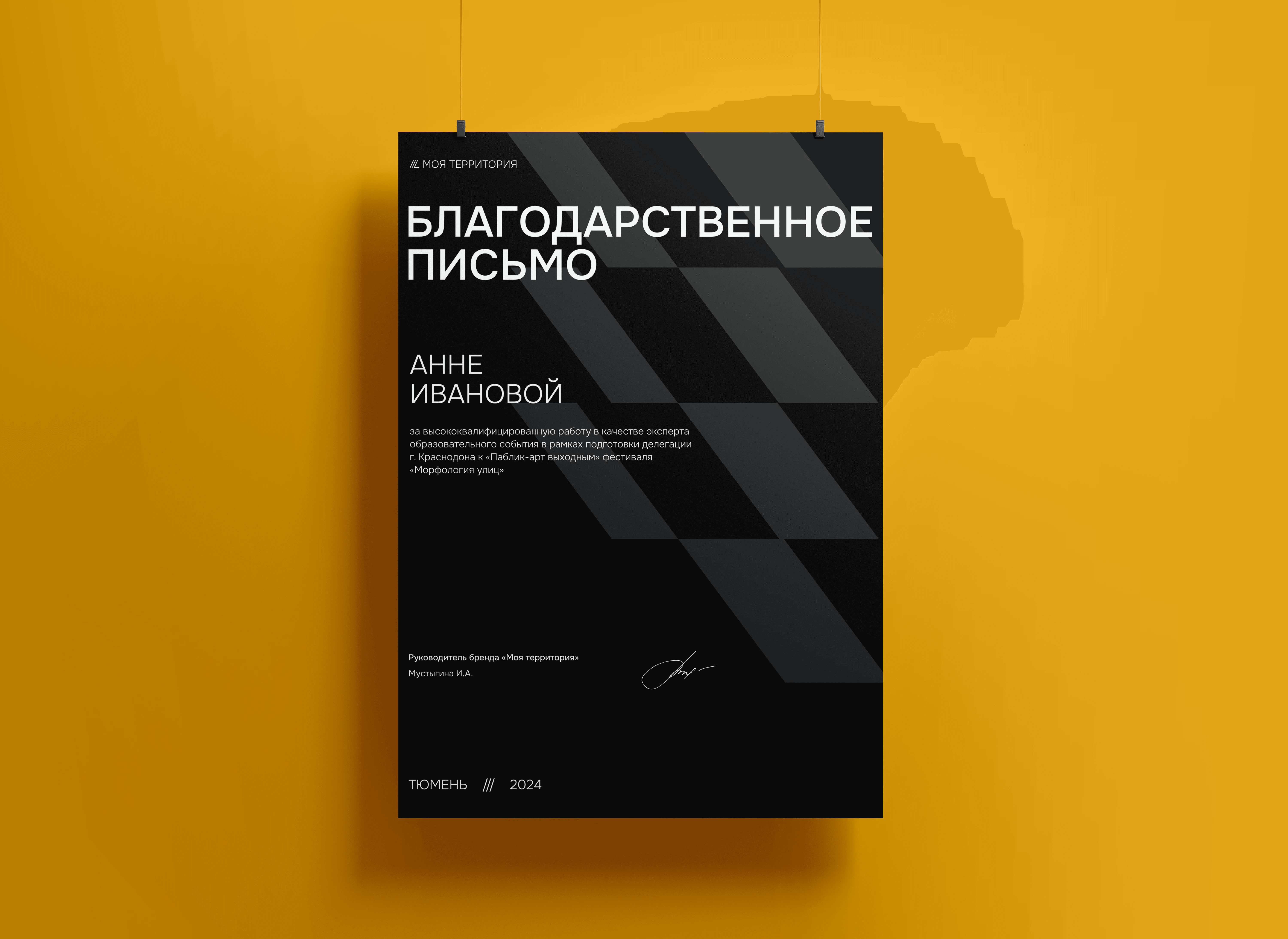
Designing logo system for three regions
Created a primary logo and regional variations for Tyumen, Ishim, and Tobolsk
Established logo construction rules, spacing, and scale
Provided monochrome versions and misuse guidelines
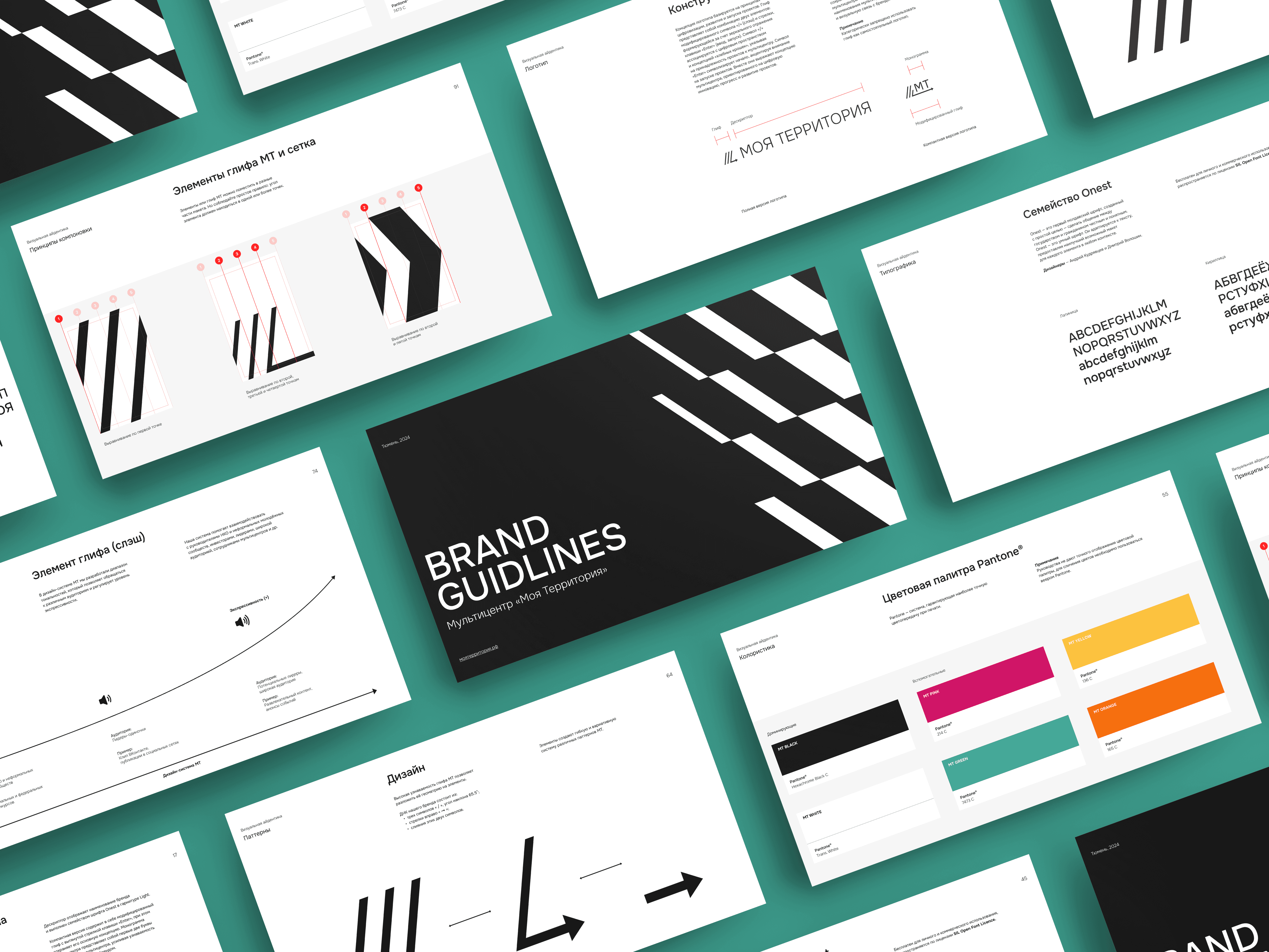
Setting up typography and color system
Selected the Onest type family and defined usage rules
Built a full RGB, CMYK, and Pantone color palette
Ensured color combinations are accessible and brand-aligned
Building a flexible design system
Created grid, layout principles, and component structure
Defined brand DNA, visual styles (monochrome, tonal, expressive)
Delivered templates for banners, merch, presentations, and social media
Delivering and publishing the brand
Developed a structured guideline with downloadable assets
Published a web page housing all logos, fonts, and regional brandbooks
Ensured ease of use for internal teams and public partners


Project discovery
Defined the brand’s tone of voice and messaging structure
Mapped out target audiences and regional positioning
Concept development
Created the core identity system and verbal structure
Ensured flexibility across locations and formats
Logo system design
Developed full and compact logo versions for Tyumen, Ishim, and Tobolsk
Finalized spacing, scale, and visual constraints
Design system creation
Defined typography (Onest), color palette, layout rules
Built modular grids and three visual styling modes
Branded materials
Designed real-life applications: merch, templates, social banners
Included layout examples and composition guides in the guideline
Delivery & publishing
Structured a full guideline for download and internal use
Launched a branded web page with direct access to assets
What we delivered
A comprehensive brand identity system for the main center and its branches
Logo set, typography, color palette, and layout rules
Practical templates and real-world applications
What really mattered
Regional adaptability without losing consistency
Clear visual structure for internal and external communication
Scalable assets for print, digital, and social use
What it led to
Strong, recognizable image across three cities
A dedicated brand page with access to all materials
Improved engagement and trust from the audience

Live brand page
A dedicated page with all key brand assets: logos, fonts, color palette, and brandbooks for Tyumen, Ishim, and Tobolsk